Appearance
tour 引导组件
基础用法
vue
<script setup lang="ts">
import type { TourStep } from '@/components/FsTour/types'
import type { ElButton } from 'element-plus'

const current = ref()

const uploadRef = ref<InstanceType<typeof ElButton>>()
const saveRef = ref<InstanceType<typeof ElButton>>()
const moreRef = ref<InstanceType<typeof ElButton>>()

/** 步骤 */
const steps = ref<TourStep[]>([
  {
    target: () => uploadRef.value?.$el,
    title: '修改数据',
    description: '点击这个按钮在弹出框中选择想要修改的数据即可.'
  },
  {
    target: () => saveRef.value?.$el,
    title: '保存数据',
    description: '数据录入完成后点击这个按钮即可提交数据到后台.'
  },
  {
    target: () => moreRef.value?.$el,
    title: '如何进行更多的操作',
    description: '鼠标移入到此按钮上即可展示出更多的操作功能.'
  }
])
/* 开始引导 */
const onStart = () => {
  current.value = 0
}
</script>
<template>
  <div>
    <el-button type="primary" @click="onStart">开始引导</el-button>
  </div>
  <div style="margin-top: 20px">
    <el-button ref="uploadRef">修改</el-button>
    <el-button ref="saveRef" type="primary">保存</el-button>
    <el-button ref="moreRef">更多</el-button>
  </div>
  <fs-tour v-model="current" :steps="steps" tour-key="tourKey1" />
</template>
混合弹窗等多种形式
vue
<script setup lang="ts">
/** 步骤 */
const steps = ref<TourStep[]>([
{
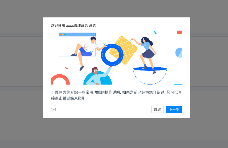
title: '欢迎使用 xxxx管理系统 系统',
description:
'下面将为您介绍一些常用功能的操作说明, 如果之前已经为您介绍过, 您可以直接点击跳过结束指引.'
},
{
target: () => saveRef.value?.$el,
title: '如何提交数据',
description: '数据录入完成后点击这个按钮即可提交数据到后台.',
// 遮罩层单独控制
mask: false
}
])
</script>
<template>
<fs-tour v-model="current" :steps="steps">
<template #text="{ step, current }">
<!-- 弹窗自定义布局 -->
<template v-if="current === 0">
<div style="margin-bottom: 10px">
<img
src="https://gw.alipayobjects.com/mdn/rms_08e378/afts/img/A*P0S-QIRUbsUAAAAAAAAAAABkARQnAQ"
style="height: 184px; width: 100%; object-fit: cover"
/>
</div>
<div>{{ step.description }}</div>
</template>
</template>
</fs-tour>
</template>属性
| 参数 | 说明 | 类型 | 默认值 | 可选值 |
|---|---|---|---|---|
| modelValue | 当前处于第几步 | Number | ||
| steps | 步骤 | TourStep[] | ||
| once | 是否只显示一次 | Boolean | false | true |
| tourKey | 唯一标识(显示一次时必传) | String | ||
| mask | 是否开启遮罩层 | Boolean | true | false |
| padding | 高亮区内间距 | Number | 6 | |
| zIndex | 层级 | Number | false |
TourStep
| 参数 | 说明 | 类型 | 默认值 | 可选值 |
|---|---|---|---|---|
| target | 指向元素 | HTMLElement | ||
| title | 标题 | String | ||
| description | 描述 | String | ||
| mask | 是否开启遮罩层 | Boolean | true | false |
| popoverProps | 气泡组件属性 | Object | 详见 el-popove |
插槽
| 名称 | 说明 | 参数 |
|---|---|---|
| title | 自定义标题 | {step, current} |
| text | 自定义内容区 | {step, current} |
| footer | 自定义底部操作按钮 | {step, current} |